Customise web page layout and content
Navigate to Studio Configuration / Website design and choose one of the 6 pages to configure the layout and content for the page.
You'll find two taps, one called Layout the other Content. In the Layout tap you can configure the page title and lead text alongside with the image appearing in the page head.
Configure page layout
The page layout controls the banner image and text of the page.
Banner size options
- Off
- No image; page displays a plain background and the page heading appears in the page body.
- Small banner
- Image size: 1080 × 432 px (recommended).
- Used for compact headers and quicker page loads.
- Large hero
- Image size: 1920 × 1080 px (recommended).
- Full-bleed, immersive hero for high visual impact.
Image handling and cropping
- If the uploaded image does not match the selected dimensions, a crop tool opens automatically after selecting the image.
- Use the crop tool to set the visible area; the editor shows how the chosen portion will display across viewports.
- The system will save the cropped result for that page, so you control what visitors see. Tip: In order to avoid your image being compressed or not cropped optimally it's a good idea to prepare an image to the specified size and avoid the inbuild cropping tool.
Text over image and accessibility
- Page heading and lead text are placed on top of the banner/hero image.
- Because text sits over imagery, contrast can vary depending on the photo. Use a image editor to apply a shading overlay in your source image to provide a good contrast to the text.
- You can adjust the text color for the heading and the lead text of the page to provide optimal contrast to the selected banner or hero image.
Tips
- For small banners, crop tighter to keep the subject visible; for heroes, allow more space around the focal point.
- Prefer simple images or shots with natural negative space behind heading areas.
- Use the fade overlay rather than heavy text outlines for a cleaner, consistent look.
- Always check the mobile preview — large heroes crop differently on narrow screens.
Configure page content
Switch to the Content Tap to change content shown within the page. Each page has automatic generated content provided from Appilates and content elements you can add and arrange. Here is an overview of the automatic generated content per page.
| Page | Automatic content |
|---|---|
| Home | The home page shows a 'Client bookings & purchases' section with info for the logged in customer, if a visitor is not logged in to your site yet, it offers a quick link to do so. |
| Class schedules | Lists all upcoming class schedules from your studio. |
| Passes & memberships | Adds two blocks, one with a list of all your class pass bundles available to buy and one with all membership products you offer. Either of this section will automatically disappear if you don't publish sales offers in the relative category. |
| About us | Displays text and images from the Studio portfolio configuration section. |
| Contact us | Features a contact form that directly sends you contact messages from your website to your Appilates dashboard. |
| Join us | Features a Register or Login view with detailed instructions in how somebody can join your studio and create an Appilates account connected with your studio. |
Alongside with the content elements described above you can add various content elements in your page and rearrange the order of appearance of the content blocks.
Custom content blocks
Appilates provides a set of ready-to-use content blocks you can add to your page content. Use the (+) symbol on any location in your design to insert a content block. Here is an overview of what they do.
Content Block
The Content Block element adds text or image content. You can arrange content side by side for larger screens. Content element features their own title and lead text.
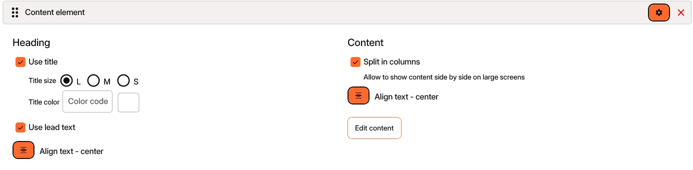
Content-Block options
Before you tap on the Edit content button, you can configure the Content-Block to your needs.
Adjust, whether you whant to Use title and Use lead text and configure font size, alignment and colour.
Use the Split in columns option to arrange content side by side for larger screens. On a phone screen the Content-Block arranges vertically.
Tap on Edit content to add text or images, you can return to the Content-Block configuration any time by tapping the cogwheel in the left upper corner.
Text in the Content-Block supports markdown formatting to apply bold, italic and heading stiles and to create links to other pages.
Image
The Image element displays an image with full horizontal size.
Call to Action
Adds a block with the 'call-to-action' text and provides links to either purchase, book or join your studio. The call-to-action block is designed to always look the same and is usually placed on the bottom of a page.
Download the App
Provides links to all App stores to download the Appilates App. We recommend placing this block on the 'Join us' page.
Find us
Displays a Google map with navigation help to find your studio. Don't forget to configure your studio's address and GPS location under the general Studio information settings.
Separator
Just adds a horizontal line to your layout.
Section background
The section background element applies a color to the page background. Each following element will be displayed in chosen colour. You can combine multiple Section backgrounds to your layout or place one section background on the top of your layout to apply a unform page background colour other than white.
Rearrange blocks
Use drag&drop to change the order of appearance of your content block elements. Each block has a drag&drop bevel left to the block title to start the drag operation. Tip: Use the 'Collapse / show blocks' option in the top-right menu to collapse the content of all blocks to rearrange the content blocks of a large page.
Related articles
All Help categories
Here all all the main help categories in the Appilates user manual.